My photography and jewelry making journey. Please visit the Vintage Cravens blog for new product releases, outfit posts, shop updates, etc.

Monday, May 2, 2016

Photographing Jewelry: A Bead Board Wall


I really like taking pictures of jewelry on white backgrounds for a cohesive look to my Etsy shop. I wanted to be able to incorporate beautiful shots of jewelry on a dress mannequin (I call mine 'Sally') to add interest to my landing page and to show the piece as intended to be worn. My husband built our home with beautiful five panel wood doors which photograph nicely, but just didn't look correct with my other cover photos...


See what I mean? Beautiful wood in a style that definitely suits my brand, but stands out like a sore thumb when displayed on a page full of bright white closeups. I will definitely continue photographing in front of our doors for social media, blogging, etc., but wanted something with a little more style than a plain white wall for cover shots. I decided to look for bead board (or wainscoting) as it is was a staple design in Victorian architecture. There are many options for printed vinyl backgrounds which are perfectly suitable for a photography studio or for portability. I wanted something a little less expensive, but still nice and easy to stow in my workshopish studio.


I ended up finding a nice short piece of wainscoting and asked the hardware store to cut it down to a square size. Here you see it propped on top of a small typing table and makeup case. Simple, easy and less than $15 total! I like how I can still use my door, then swap in the bead board for a brighter, white option.

Happy photographing!
Chris

P.S. Scarves look great for my crochet pattern listings as well. Love it!


Tuesday, April 19, 2016

Photographing Jewelry: The Gem-o-licious Layer


Have you ever looked at a beautiful photograph with just the right amount of focus on a key subject and a nice, dreamy background? It took me FOREVER to finally understand what in the world the 'f-stop' setting is doing on my DSLR camera and I hope this might help you, too! Photographing jewelry can be a complete joy or can make you want to throw your camera out the window. I like to keep listing photos simple and clean on white backgrounds (see my blog post about this here), but there are times when the light is just right and I just want to capture the beauty of these miniature works of art for myself and for social media. Near the beginning of my photographic journey, I read a lot about 'f-stop' and 'depth of field,' but things never quite clicked for me. Here is what finally made me realize what depth of field really is: it's like looking through a double-decker sandwich to your jewelry and beyond. 


Image Courtesy of Way 2 Foodie


Whoa, Chris, did you just say that? YES! Imagine that sandwich on its side and your camera in front. Now, picture your jewelry as the lettuce. Changing the f-stop moves through the bread, tomato, turkey and finally to your lettuce to bring it in focus! This is the perfect 'depth of field' to bring your piece to life, right at the layer you want to highlight. Once you have the f-stop set, choose the shutter speed that brings in the right amount of light you want to expose your photograph with (I like to slightly over-expose, or make brighter, my photographs and make them darker if needed using post-processing). Or, you can totally cheat and use the setting on your camera that automatically selects it for you based on your f-stop and lighting conditions. This is typically called 'aperture priority.' 

F-stop Selects the Layer to Focus On


Hopefully this sweet vintage camera (photo courtesy of PetaPixel) and sandwich on its side will resonate with you and help you remember what f-stop/depth of field is. Now, take a look at the picture I took of three beautiful vintage rings from my Etsy shop. Notice where I have the f-stop set? That's right - right on the ring faces, or what I like to call 'the gem-o-licious layer' of jewelry. The foreground and background are blurred nicely and the gems reach out and say hello. 


Now you've seen what helped me learn about depth of field. What handy tricks do you have for understanding this concept? 

Happy shooting!
Chris

Friday, April 8, 2016

Photographing Jewelry: White Backgrounds


Have you ever wanted to capture a piece of jewelry on a beautiful white background, or nice gradient like the one above, which shows shadow and highlights your piece? There are many articles available on the web about lighting set ups and on camera tips. This blog post focuses on post processing.

As I was learning how to use my camera to photograph jewelry, I tried many different methods for lighting my set, different backgrounds such as paper ramps, light boxes, etc., but still wasn't happy with the results. Why? I kept seeing grey instead of a nice, bright white which would fit nicely with my website, Etsy and Google search results. No matter how much light I used, how perfectly my white balance was set or how I would use reflectors to bounce light back into the set, grey would still be present in my photographs. I began to play around with post processing using several free editors and learned about adjusting the brightness values in a photograph's histogram. Over time, I bought Photoshop Elements (roughly $70) as I have found their Levels tool to be the quickest for processing many photos in a session.

The writers at Cambridge in Color have done an excellent job detailing the technical aspects of what I'm about to show you in their Photoshop Levels tutorial. I'm going to keep things simple and just walk through using Levels which is Photoshop's tool to do this. At the end, I've also included an example from Photoscape, a free photo editing tool.

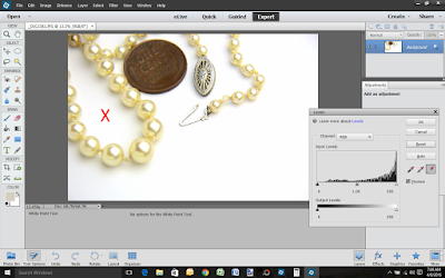
Step 1: Open the Levels Tool

Open your UNCROPPED photograph in 'Expert' mode. Before cropping your photo, select Enhance --> Adjust Lighting --> Levels... from the menu at the top.

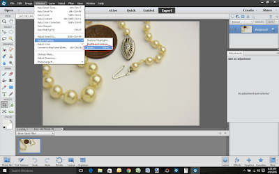
Selecting the Levels Tool


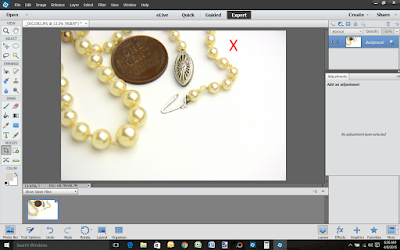
Step 2: Set the White Point

Once the Levels Tool is open, the next step is to find the best white point in the photograph. To do this, select the Set White Point eyedropper in the Levels Tool (your mouse pointer will change to an eyedropper). Now, click on a spot of white in your photograph. The tool will adjust the background to the white point you've selected and will brighten the background, but leave the object in tact. Note: you may have to try several spots in your photograph to get 'just the right white point,' so don't get frustrated if your photo doesn't look right the first time. Simply select Reset in the tool and try again.

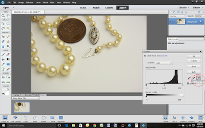
Selecting the Set White Point Option
Note: another option available to you at this point is to adjust the histogram by sliding the pointers just below the histogram image to adjust the white, midtone and black values. I like this option for fine tuning, but have found the simple Set White Point eyedropper the easiest to use in my process.


Here are a couple of examples showing different results when the white point is selected from different areas of the photograph. My light source is aimed from the right side of the photograph casting nice shadow to the left of the necklace. When selecting an area of shadow, the light in the photo blows out and will diminish the object in the foreground.

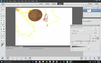
White Point Set in an Area of Shadow

Here is another example of selecting a white point that isn't in a direct shadow, but further away from the light source. This looks pretty good, but the penny and pearls are a little off color.  

White Point Set Away from Light Source


Here is the photograph I like the best. I ended up selecting a point just to the right of the pearls to capture the light without a shadow cast. It still has some grey edges, but this is okay because we're not quite finished yet.

White Point Set in Area Without Shadow Cast Near Light Source


Step 3: CROP!

Once the subject is a nice, true color and your background is mostly white, it is time to crop the photograph to select just the right area for display. Here, I've cropped out the grey corner on the upper right and zoomed in so the gold content mark on the clasp is visible.

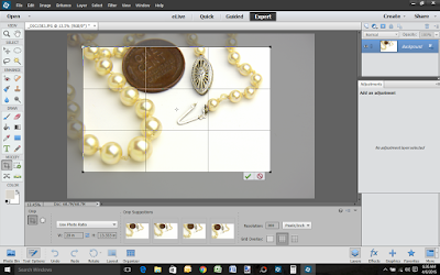
Using Photoshop Elements Crop Tool


Step 4: Enjoy The Fruits of Your Labor

Here is the final results. A nice product photo showing true color of the pearls on a nice, bright white background. Leaving a little bit of shadow in photographs adds a touch of reality to the product being featured as well. Since customers cannot touch and feel our products online, anything we can do to provide a sense of weight and depth helps close a sale.
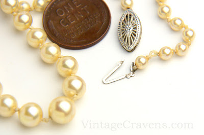
Final Result

I hope you've enjoyed this quick tutorial and would love to hear your tips and tricks for white backgrounds.

Happy Day!
Chris

P.S. Many photo editors have an option to adjust the histogram. To find them, look for words like 'histogram,' 'curves,' and/or 'luminosity.' For those who take photos on their phones, a reader recommended Photoshop Express and Be-Funky Photo Editor and Collage Maker. Here, I'm going to walk through how to use a free photo editor for Microsoft computers called Photoscape. In Photoscape, there are two ways to adjust values in this software: by changing the Luminance Curve or by Brightening the photograph.

To change the Luminance Curve, select the down arrow next to the Bright,Color button, then select the Luminance tab. Then, drag the top point of the histogram to the left to brighten the photograph. This option will generally keep the subject colors closer to true. Try moving it to different places to see how the effect changes.

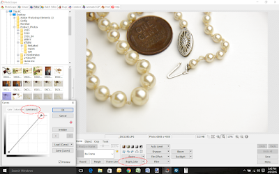
Adjust the Luminance Curve in Photoscape

To brighten the photograph, select the Bright,Color button, then move the Brighten slider to the right. This option is very easy to use, but will often wash out the subject as shown below. Try moving some of the other sliders to see how the effect changes.

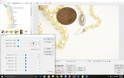
Change the Brightness in Photoscape

Thursday, March 31, 2016

Build a Line Challenge 2016 - All Jeweled in White Reveal!


I can't believe we're here - the final blog post in B'Sue Boutique's 2016 Build a Line Challenge (BALC)! It has been an incredible learning experience for me and I'm pleased to announce the first run of the All Jeweled in White collection!

Here is a short & sweet video introducing my new All Jeweled in White line. Press play & enjoy!


In this last session of BALC 2016, we spent a considerable amount of time discussing, well, time! I really thought through how I would manage the limited time I have available and made some serious decisions about the level of inventory I wanted to make, how I wanted to approach sales of my line, etc. I have listed the pieces in this post on Etsy at VintageCravens with the intention of adding more styles throughout the year. I sketched up over thirty designs for this line and more ideas are floating around in my head!


All Jeweled in White - Elegant Drop Earrings in Pearl & Crystal

The simple, yet elegant, earrings above are an example of time management and branding for All Jeweled in White. I learned how to batch work for building jewelry and also designed hang cards to feature my new Vintage Cravens logo. I had a goal to make enough inventory to launch on April 1 to coincide with this post plus come up with packaging that will work for both selling online and in person. I'll be working on booth designs over the coming months for a show I'm doing with my Mom & sister in August. Stay tuned for more...


All Jeweled in White - French Filigree Pendant Necklace

As the class progressed, we learned about branding. I learned so much over the past few years in running VintageCravens for vintage and antique jewelry, but this was a new experience for me in thinking through how to tie a line together. The photo above is an example of where I landed. I love the robin's egg blue color that was popular during the Art Nouveau movement, but decided to add a little gold and off white to my background to give it a more modern feel and to anchor everything in my photography for All Jeweled in White. I purchased some beautiful antique French love letters and will use them along with several books, lace and other timeless props in my photographs for this line. I love how the letters look with this beautiful pendant necklace featuring a vintage French filigree panel studded with rhinestones, pearls and crystals. This necklace is designed to go with the simple, elegant earrings I shared earlier in this post.


All Jeweled in White - Long Necklace with Bird Charm, Pearls & Crystals

As I practiced jewelry making techniques during the BALC 2016, I felt drawn to the beautiful bird charms from B'Sue Boutiques like the one you see above. I love their timeless style and their ability to go from delicate to bold in an instant. For my All Jeweled in White line, I have used this sweet bird motif in several coordinating pieces including a long necklace, a choker and bracelet. All of the pieces work well together and with my elegant earrings as well as other earring designs in the line.


All Jeweled in White - Calcified Bronze Lily Bracelet with Pearl & Crystal Drops

One of the most exciting things about my new line is a patina I created to replicate the beautiful calcium deposits found on bronze statues in many gardens across the states and abroad. I call this a 'calcified bronze' patina and have written a blog post about the inspiration for this patina here. This patina is on a few pieces in my new line and I will be adding more over time. As I was making these bracelets, I began exploring options to make them adjustable for multiple wearing options. I decided to do this with all of the bracelets I make by adding extender chains in just the right places and tipping them with crystals, pearls or antique brass beads to complete each design.


All Jeweled in White - Lady in White Bib Necklace

While the majority of the pieces in my line are made as multiples, I will continue to create one of a kind designs to top off All Jeweled in White. The example above, Lady in White Bib Necklace, is one of these pieces. I applied my calcified patina to a piece of polished raw brass giving the beautiful lady a whitewashed golden garden statue look. She is surrounded by vintage components, pearls and crystals and suspended from a beaded chain I made using vintage Japanese glass beads and Czech glass pearls. The Lady in White is also signed and dated. She is truly unique and there will never be another like her.


All Jeweled in White - Loop Drop Earrings

I hope you've enjoyed a peek at my new line (entire collection available at VintageCravens on Etsy). I have really enjoyed this class and am thankful for the opportunity to have met so many talented ladies while learning from one of the best artists in the industry - Brenda Sue Lansdowne of B'Sue Boutiques. I feel confident in taking the next steps to continue developing my All Jeweled in White line, taking it jewelry to local venues and the future possibility of wholesale options for boutiques wishing to sell my pieces.

This is the final post in a three post installment for the BALC 2016 blog hop (post 1 is available here). I hope you have enjoyed this journey as much as I have!

Have a wonderful spring!
Chris


BALC 2016 Blog Hop

Be sure to visit the talented students in the BALC 2016 class. I am amazed at the amount of work these talented ladies have been able to accomplish in such a short amount of time.


Saturday, March 26, 2016

Calcified Metal Statues as Jewelry Patina

My 'Calcified' Patina
For my All Jeweled in White line, I am looking for interesting ways to add touches of white to the jewelry I create. Pearls and crystals are an obvious way to do this, but I wanted to try something different.

I personally adore the look of a beautiful bronze garden statue as it develops white streaks from the calcium and magnesium carbonates in water it comes in contact with. With this in mind, I decided to create two patina treatments for raw brass components. The first is a two step process to 'calcify' the raw brass and seal it. The second involves the same process as the first with the addition of a torch patina base.


Raw and Torch Patina Links

I have tried torch patinas before, but this was a good day for me to practice on various shapes and sizes of metal. Something I had read about, but needed to learn by doing, is all brass pieces will not develop the same level of patina via torch (or other methods). Because the metal content can vary from batch to batch, piece to piece, slight, and sometime significant, differences in the darkness of the metal can occur. 


Unsealed Ladies

Something else I had fun developing with the torch and brass was an understanding of how different lengths of flame and time can produce distinct results. In the Unsealed Ladies photo above I've included four samples. Clockwise from the top right is the original raw brass component, then three variations of my calcified patina: a deep torch patina, on raw brass and a light torch patina. I really like how all of these turned out and couldn't wait to apply the final step and seal the pieces. 


Calcified Ladies, Final Sealed Product vs. Raw Brass (top left)

I was thrilled to see my calcified patina come to life as I applied the final step of sealing each piece with a glossy finish. I love how rich each test piece appears and will be making beautiful jewelry to compliment each finish. Do you have a favorite or something that inspires you as a finish for jewelry? If so, I'd love to hear your comments.

Have fun!
Chris

P.S. I couldn't leave without sharing a few beautiful photographs of streaky bronze garden statues from around the web. Enjoy!
NY Botanical Garden, Roses of Yesteryear Statue via Ephemeral New York

Savannah, GA, Bird Girl Statue via The Art of Nothing

Missouri Botanical Garden, Zerogee Statue via Sophe Conference

Savannah, GA, Haitian Statue via You're Welcome Savannah

Singapore Botanic Garden, Frederic Chopin via Alice Sg

Paris Pont Alexandre III Bridge via EU Touring

Springfield, IL, Abe Lincoln and Family via Getting the Picture

Friday, March 25, 2016

FUF: Agate and Vintage Glass Necklace


I love how this necklace turned out! The blues of the vintage glass beads complement the agate so well it is like they were made for one another. I decided to use a simple antique silver chain to bring everything together with this one.

Happy Friday!
Chris

Wednesday, March 23, 2016

WTW: Agate and Vintage Glass


This is a custom order for a very special customer. I had converted a pair of vintage clip earrings featuring beautiful Japanese glass turquoise stones with a black matrix to posts. She loves them, but was hoping for a necklace as well. I was thrilled to find a vendor with a handful of coordinating stones and another with the stunning agate I wrapped in titanium wire. Can't wait to see this one come to life :)

Happy Day!
Chris